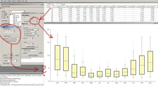
Average value in box plot

vodicka
perhaps stupid question, but I am not able found how can I easily add the average values from columns to the box plot. In Box plot utility program is able to add only percentiles from rows or columns. I tried use Analysis->Packages->Average Waves program for mean calculating but it work only in horizontal direction. Is there any way how can I easy calculate and add average wave values (from the columns) to the box plot?
Thanks,
Petr


A box-and-whisker plot is used to show median values and percentiles. Typically the box shows the quartiles and the whiskers something like the 10th and 90th percentiles. I presume that you would like the central line to be the average value. What would the boxes show? What would the whiskers show?
It may be possible to come up with a manual way to create the graph you want.
John Weeks
WaveMetrics, Inc.
support@wavemetrics.com
May 9, 2011 at 11:05 am - Permalink
I would like to make two types of box plot:
1) To the box plot with meadian and percentils I would like add line with average together with median (we would like to see difference between them in one box plot)
2) Instead of median and percentils I would like to make box plot with mean, mean standard errors like box sides and standard deviations like whiskers
But of course I can make it by manual way ;-) I just tried if there is another useful utility like for median and percentils.
Petr
May 10, 2011 at 04:18 am - Permalink
You can make the regular box plot, then add a wave with averages to the plot. You may need to fiddle with the settings for the average trace to get it to look right.
This is harder- to make the package do this would require modifying quite a bit of code. You might try making a box plot, then replacing the waves with average, standard error and standard deviation. In order to do that, you should be aware that the box plot package makes the boxes using error bars applied to the median wave. So the waves that define the boxes are the difference between the median and the quartiles. The whiskers are also error bars- the quartiles are plotted as small dots so they don't show; then the 90th percentile (or whatever you choose) is plotted as an error bar on the quartile traces.
These are good ideas- I will put them in the wish list for the next time I work on the box plot package.
John Weeks
WaveMetrics, Inc.
support@wavemetrics.com
May 10, 2011 at 12:45 pm - Permalink
But I actually fig out an easy way to do it. Just plot your average and stdev as a normal category plot. Then appendtograph the data points using a free axis for each set of data wave.
May 19, 2011 at 02:36 pm - Permalink
Igor 8 will have built-in box plots. While it doesn't support a box with mean and standard error of the mean boxes, it does support adding a marker for the mean, and the whiskers include an option to represent +- standard deviation around the mean.
In addition, you can show all raw data with jitter (horizontal offsetting of data points so that they don't overlap), six options for whisker length, control of line style, color and width, etc. The box plot is a new kind of graph trace, allowing you to freely mix box plots, violin plots (also a new built-in trace type), normal graph traces, images, etc.
John Weeks
WaveMetrics, Inc.
support@wavemetrics.com
November 9, 2017 at 02:26 pm - Permalink
November 9, 2017 at 10:24 pm - Permalink
John Weeks
WaveMetrics, Inc.
support@wavemetrics.com
November 10, 2017 at 09:52 am - Permalink