My graphs have the same absolute height and width however are not the same.


Hello,
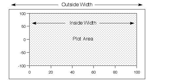
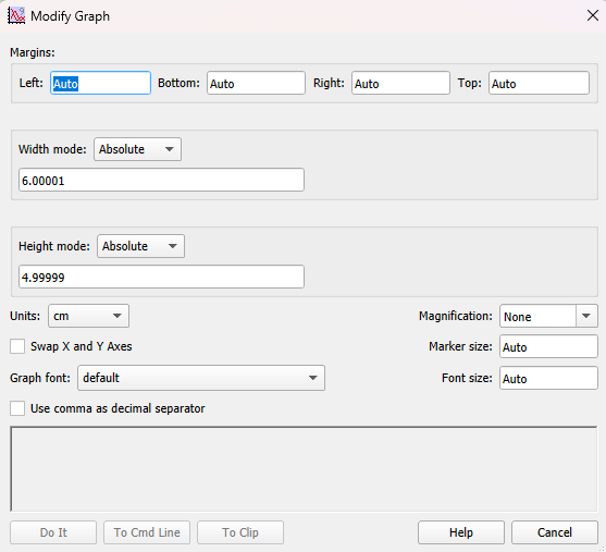
I'm wondering if anyone can help with this problem I'm having with graphs. Within IGOR my absolute width and height for each graph (see attached images) are 6.00001 cm and 4.99999 cm respectively. The Igor Help Topic says that the height and width here should refer only to the internal region of my plot as shown in the attached image.
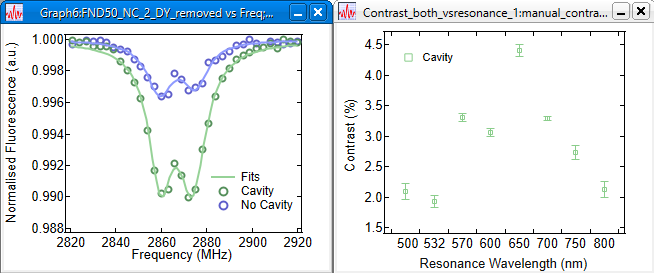
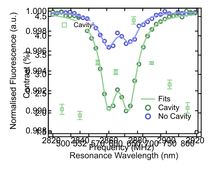
Unfortunately, with the "standoff" box checked, the graph areas no longer match in size; I've included an example of the graphs in IGOR side by side and then the two overlayed in Inkscape (aligned to top left corner). Note that the graph on the right in IGOR is a category plot, while the graph on the left is an XY numerical plot.
Is there a way to control the standoff relative to the absolute size? The help section doesn't appear to mention how standoff is calculated. I could remove the standoff however the axes become cluttered in this instance.
Kind regards,
Roy.
The extent of the significant digits on the tick marks on the axes is different. Hence, the difference. Someone at a higher level of skill than me can recommend how to tweak the margins to adjust. In the meantime, my brute force approach would be these steps.
* Increase the digits past the decimal point on the ordinate to the Contrast graph to show 4.50, 4.00, 3.50 ... and so on.
* Decrease the number of digits past the decimal point and the number of major tick marks on the ordinate on the Normalized Fluorescence graph to only show two main ticks at 1.00 and 0.99. Put the other tick marks as minor tick marks.
As a side note with apologies if it seems nit-picking, should you be making these graphs for publication, I offer a few additional suggestions.
* The color choices of light blue and light green are not the best contrast for distinguishing the symbols or curves. By example, the symbols on the Contrast graph are for example both too small and too light to see well.
* I am not a fan of legends in graphs as opposed to putting annotations on the data curves. I also appreciate when graphs have titles inside them. See the attached example.
Should you decide to use the colors and the legend, then also use different symbols and different line scales. To see way, print your Fluorescence graph in grayscale and tell me how well you know which curve is which.
Also, if the ordinate on the Fluorescence graph truly is a.u. for arbitrary units, then you could just as well eliminate the numerical values on the ordinate. Otherwise, staying with numbers, are the units perhaps not truly arbitrary but are instead relative (fractional) transmission or absorbance?
February 10, 2025 at 08:10 pm - Permalink
I am not sure if the standoffs are at fault or the variable margin, as JJ mentioned. I recommend to fix both the margins and the plot size and see how this works for you. I also don't know how the standoff margins are calculated, but I am no fan of standoffs anyway and switch them off at all times. :-) I strongly suspect that the standoff margin is not counted as part of the plot area, and is thus unaffected by the fixed size.
To control the sizes of graphs quickly and conveniently, I also shamelessly recommend my graph tools, which you can find here:
https://www.wavemetrics.com/node/21562
P.S.: I also used to load graphs into Inkscape for post processing for many years, but stopped doing that. As it turns out, there is almost nothing what you cannot do directly in Igor itself with the added benefit that the plot updates instantly when your data changes. ;-) Let me know what you want to do and I can help you with that.
February 10, 2025 at 11:42 pm - Permalink
The comments made by jjweimer and chozo are spot-on. Just for understanding, the varied margins are the problem. You can make your graphs have the desired consistent size by setting the margins to the same fixed number. Do that in the Modify Graph dialog.
chozo's package includes that as part of what it does.
February 11, 2025 at 10:04 am - Permalink
If you are putting the graphs into a layout, another option is to make the graphs subwindows. Then you can use the subwindow layout guides to fix the positions of the axes to be coincident. That is, if they are above and below, you can tie the vertical plot areas together. If they are side-by-side, you can tie the horizontal plot areas together.
DisplayHelpTopic "Embedding and Subwindows"
DisplayHelpTopic "Subwindow User-Interface Concepts"
February 11, 2025 at 10:11 am - Permalink