Rescaling axes on a color table bar

Nick W_
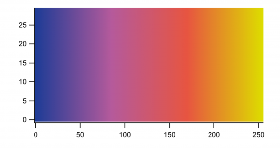
I have attempted to do this as follows:
<br />
Make/O/N=(256,30) cbar=p*(0.672/254)<br />
Display;AppendImage cbar<br />
ModifyImage cbar ctab= {*,*,ametrineCTAB,0}<br />
End<br />
The resulting plot is attached.
It seems that the x-axis runs the range of the index of the wave, rather than the values in each column (which run from about 0 to 0.7). I have tried using SetScale to change this, but nothing seems to happen. A 3d surface of this color bar image seems to have the z-values running from 0 to 0.7, however.
How can I change the x-axis scaling to reflect the correct range of values?


should do the trick.
John Weeks
WaveMetrics, Inc.
support@wavemetrics.com
April 19, 2018 at 04:52 pm - Permalink
DisplayHelpTopic "Color Table Waves"which allows you to use the same color wave with different data ranges.
And look in the Igor Pro Folder/Color Tables for Igor binary waves of various color table waves, including Ametrine.
--Jim Prouty
Software Engineer, WaveMetrics, Inc.
April 19, 2018 at 07:04 pm - Permalink
Jim, the yellow end of the VioletOrangeYellow table got a bit too bright to show up well on my figure, and I was struggling to limit the range it sampled from.
Nick
April 20, 2018 at 11:12 am - Permalink