Separate graphing of groups of rows within a single wave

RJS
Thus, Y and X are typically single columns of data, with treatment defining to which group those data belong.
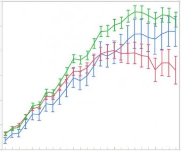
Is there a (easy; yes I know I am lazy) way to graph the single y wave against x, group by treatment, and then allow, for example, curve fitting for all rows belonging to a group?
See attached image for an impression of what I am looking for visually. The three colors represent different treatments.
My next option is to write some scripts that allow the use of subsets of rows within the single waves for further procedures, but I thought I'd see if I have missed something obvious.
Thanks for any insights.
-Ruud


Have I understood correctly when you write 'single y wave against x' that you are dealing with only one dimensional waves: xwave, ywavetreatment1, ywavetreatment2, etc.? In that case, one way to organize your workflow is to choose wave names (or wave notes) that can understood by your scripts. Then you would build a list of wavenames for further analysis, either by parsing the names or through user input, and loop through that list applying some kind of processing? I think you'll need to be a bit more specific about the format of your data and what you're trying to achieve if you're looking for more specific suggestions than that.
February 20, 2018 at 11:21 am - Permalink
February 20, 2018 at 11:44 am - Permalink
* Graphing: Use treatment as a definition of marker color or type. You may need to code something to replace the ASCII text with a suitable marker. One approach would be to create a marker wave and then do this step as many times as needed ...
--> This approach will not give any "connect the dots" lines. When you insist that you want them as well, you must separate your x,y,treatment triple into as many x,y wave pairs as you have different treatments.
* Analyzing: The hard way is to write an all-at-once-fit function that handles your single x,y,treatment triple as a single wave. The easy way is to separate the x,y,treatment triple in to as many x,y wave pairs as you have different treatments.
For an example of the output from an all-at-once-fit-function approach, see the last figure in my publication here ...
Surfaces and Interfaces - Gailliard, Maharanwar, Weimer, and Williams
Unless you absolutely must extract the same parameters from all inputs regardless of treatment, I would advise to avoid this path.
--
J. J. Weimer
Chemistry / Chemical & Materials Engineering, UAH
February 20, 2018 at 12:24 pm - Permalink
Another analysis program I use very frequently is JMP and the features it has that could act as basis.
With a graph I can select marker by column (where column is their term for 1D wave). This color/marker codes based on a wave without the need to create a specific coding column. They call it row legend. The column(wave) can be either numeric or text (ordinal/nominal).
The other really nice feature is in fitting. There is option to "group by" and again a column (wave) is used to identify. When I then select curve fit to a line (for example) I will get n fits where n is the number of unique levels in the column/wave.
Andy
February 20, 2018 at 01:02 pm - Permalink
I managed to come up with a way to do this using my original table as (somewhat vaguely it seems ;) described earlier.
However, its is still a multistep process...
Funny you should mention JMP; this is what I use all the time to generate the types of tables in question.
Anyway, I basically re-purposed parts of a script of a friend of mine once gave me and created a small do/while loop that chops the single data waves into subset waves (for lack of a better word), which I then can plot, and use the "Waves Average Panel" to get at what I want. Its a specific solution to my problem, but perhaps it is useful..
Here is the "script"; apologies for not putting this in the right format (probably); this is the first time I actually post code.
[JimProuty added <igor> tags around the code]
February 20, 2018 at 06:57 pm - Permalink
Here is what I cobbled together with the idea of creating a wave to match the text wave with the ids that can be used for color and/or marker f(z) options in graphing. This has some limitations in that if lines and markers are used then different id's would be connected. If this is a problem one option would be to sort and then insert points with NaN values.
It takes a text wave as input and creates a marker wave with a numeric value for each unique text value.
Andy
February 20, 2018 at 07:34 pm - Permalink
I'm not sure what you are doing with Waves Average, but both graphs and the CurveFit/FuncFit commands accept wave subranges. That might allow you to avoid the chopping part, and the extra waves that come along with it.
If you need to average together several of the chopped bits, then your approach seems like the best one.
John Weeks
WaveMetrics, Inc.
support@wavemetrics.com
February 21, 2018 at 11:03 am - Permalink