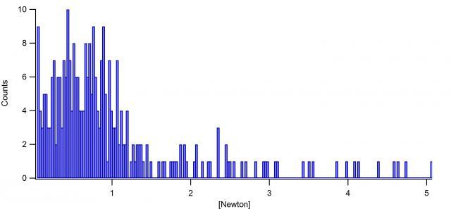
Histogram with percentage axis
i recently started using Igor Pro 6.3 to analyse force spectroscopy data (aquired by atomic force microscopy). To analyse them i create histograms of each measurement consisting of up to 300 values.
As far as the normal way to make a histogram, Igor sets the y-axis as "counts". (e.g.: like in the attached picture).
Now, everything i want to do is convert the y-axis from "counts" to a "percentage" axis. So, i don't want Igor to simply count up the measurement data between a unspecified interval, but to show me how many percent of my measurement datapoints are between a unspecified interval (depending on bin range, bin width etc.).
Neither could i find any solution online, nor in the "getting started" option in Igor.
I am very looking forward to a solution from you!
Thank you very much!!
sneakpeek


April 18, 2016 at 05:31 am - Permalink
How can i multiply the _hist wave? Is there a certain command line i have to enter?
April 18, 2016 at 06:04 am - Permalink
wave_hist*=100
April 18, 2016 at 06:32 am - Permalink
In the trace modify dialog, select offset and then y multiply by 100.
The reason I prefer this approach is that I like to get the data in as raw a form as possible. This true when I have to start to compare different results and want to normalize the the results to (0->1).
Andy
P.S. Not my find, but the answer to the same type of question I posed awhile back.
April 18, 2016 at 07:43 am - Permalink
I strongly recommend selecting Help->Getting Started. That help topic includes the Guided Tour. Do at least the first half of the Guided Tour. It covers that question as well as a number of others. It will take some time, but the basic knowledge you gain will quickly save much more time.
John Weeks
WaveMetrics, Inc.
support@wavemetrics.com
April 18, 2016 at 09:52 am - Permalink
I now made it through the "Getting started" part but somehow were not really able to get a solution here.
I will show you now three different graphs,
One who is untouched, with 250 bins and bin width of 0.02 (Graph_1).
One where the "normalize result to probability density" (Graph_2),
and finally one where i multiplied with the offset funktion (Graph_3).
But somehow i dont get what Igor shows me at the end. I just want the y-axis to be from 0-100% (or less) but here it gets higher.
I really can't figure out what i am doing wrong...
April 19, 2016 at 04:42 am - Permalink
Histograms show information about the area of the bar. The value on the y-axis multiplied by the bin width is the %age in the case where you Normalized and then multiplied by 100.
It sounds like you want a "bar chart" version where you disregard the bin width, so you can read off a %age of events?
April 19, 2016 at 05:36 am - Permalink
Clearly your "normalize result to probability density" didn't work as it said, nothing in the graph should has a value above 1
April 19, 2016 at 07:44 am - Permalink
I also recalculated some input data for Igor to analize and right now it seems to work(with a formula that calculates the "raw-values" to "percentage-values" (also i had quite a wrong expectation of what kind of percentage-histograms i wanted to get).
so, now i get a percentage-y-axis and a correct view of the force (Newton) on the x-axis. [I am so happy about that :) ]
I really appreciate your help here guys!
Thank you very much,
sneakpeek
April 19, 2016 at 01:16 pm - Permalink