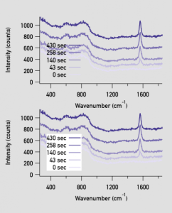
Make graph legend transparent but still cover traces?

reepingk
I have a slight issue. I'm currently making a poster for a conference that does not have a white background. (I despise white, boring backgrounds.) Instead it essentially has a very light grey background. Not much different but it sets it apart enough to be noticed.
Anyway, all of my graphs have transparent backgrounds to avoid the ugly "white box" around graphs. However, the legend cannot be transparent because it is on top of some parts of some traces. If I make the legend transparent, the traces can be seen behind it which makes it really hard to read.
What I WANT is for the legend to block the traces behind it, but still be transparent so that when I put it over top of a light grey background, I don't see a white box around the legend, is that possible? Alternatively, I could simply make the background for the legend the exact same light grey, but then that makes the graphics one use only, specifically for this poster using THIS grey. I like to make graphics I can reuse in multiple places.
Both attached graphs are BAD. (I've artificially darkened the grey behind to accentuate the point I'm trying to make.)


In your case, they appear to be the same, but I'd choose the window background color and see if that does what you want.
--Jim Prouty
Software Engineer, WaveMetrics, Inc.
September 9, 2014 at 10:02 am - Permalink
Thanks for the suggestion Jim. Unfortunately, neither of those options worked. I tried them both before posting. I think the problem is that initially, the graph background is white. It is only transparent when it is exported as a certain file type (PDF in my case.) The "save graphics" makes the background transparent, but does not change the annotation background. I tried saving the graphics as a transparent PNG, and reproduced the same results.
As of right now, I simply changed the background of the annotation to the color of the grey, but I would like to know this for future reference if it's possible.
September 9, 2014 at 10:15 am - Permalink
It seems that you're asking for the legend background to be intelligently transparent. That is, opaque for traces, but otherwise transparent. Did I get that correct? This sounds to be not possible.
For your workaround, I would suggest making the legend background take on the graph window background and then alter the graph window to match the poster. To make altering graph background simpler, create a small function using
ModifyGraph/W=$sGraphName wbRGB=(62720,62208,60416).Where wbRGB=(62720,62208,60416) are the values for your poster background. I had to do this recently for a similar, but slightly different problem.
September 9, 2014 at 11:43 am - Permalink
I don't have an easy or elegant solution for your problem. It is one reason why I avoid colors on backgrounds in graphs. It is also one reason why I avoid legends in graphs.
When you stick with a transparent background, then perhaps you should do the example below instead. The red stuff is my editing.
BTW, the lightest purple on gray is impossible to read. Are you really sure this is where you want to go? Are you really sure this is attractive to the majority of your audience (and not just a whim that _you_ insist they should all accept, difficulties and nuances be damned)? Lots of good stuff comes in plain white wrappers, and lots of good stuff gets swallowed in the results from folks who go unnecessarily toward fancy on borders and colors and legends and other things.
--
J. J. Weimer
Chemistry / Chemical & Materials Engineering, UAHuntsville
September 9, 2014 at 03:39 pm - Permalink
I should probably label them like you have suggested. I'll see if I can make that look nice.
Again, thank you for the suggestions.
September 9, 2014 at 04:01 pm - Permalink