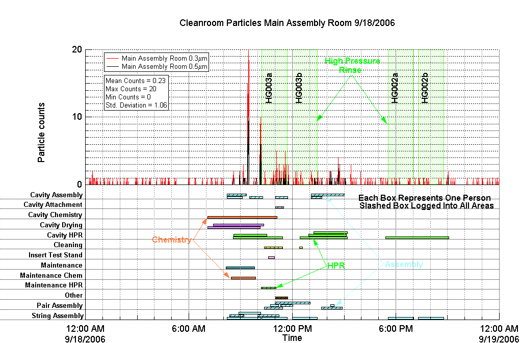

This graph associates airborne particulate counts with activities in the Department of Energy's Thomas Jefferson National Accelerator Facility production clean room. The counts are shown on the upper half of the graph along with the times that critical component cleaning was underway (shown by the green speckled bands). The lower half of the graph shows the personnel load involved with different activities. A rectangle is drawn for each person that has logged in to perform an activity. A macro handles stacked display of multiple users, allowing the viewer to quickly determine not only the number of people in the clean room but also the number of people performing an activity. Color is used to associate similar tasks and the slashes are used to identify people logged in as users of multiple areas of the cleanroom.
Submitted by Timothy M. Rothgeb, Thomas Jefferson National Accelerator Facility

Forum

Support

Gallery
Igor Pro 9
Learn More
Igor XOP Toolkit
Learn More
Igor NIDAQ Tools MX
Learn More


