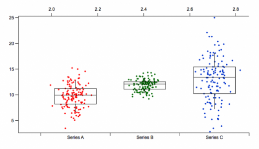
Data Points added to Box Plots
The layout is similar to that produced in JMP and I have found that the addition of the data points to the box plots very useful.
In the attached example I overlayed the box and whisker on top of the datapoints. For Series A, the label is set at X=0, Series B at x = 1, and Series C at x =2. I created a wave for the x values for each series with x = 0 + gnoise(.3), x = 1 + gnoise(.3).... and then plotted the series values versus the x value waves. The reason for the jitter is to show points that may overlap because they have the same value.
This adds another dimension to looking at the data. I think it would be an easy addition. Everything for the folks at Wavemetrics is easy.


Added /NCAT flag to AppendToGraph. Causes trace to be plotted normally on what otherwise is a category plot. x values are just category numbers but can be fractional. Category numbers start from zero. This can be used to overlay the original data points for a box plot. Here are examples:
April 2, 2010 at 08:21 am - Permalink
Dear Dr. Hededus,
I am a very naive beginner of the use of Igor, and I found your fascinating post about Data points added to Box plots. I would really appreciate if you can teach me how to create this graph.
According to your post,
1. make a dot plot graph.
2. calculating the median, upper and lower quartiles
3. overlay the box plot on the dot plot.
I am completely in the dark how to do this, and appreciate if you give me any kinds of advice.
with best,
Takefumi
August 4, 2016 at 01:16 am - Permalink
I will attach a little experiment I wrote called "Box it.pxp".
Better a better solution is to look at Igor Pro 7 which has all this built in and more.
Andy
August 4, 2016 at 06:28 pm - Permalink
Hi Dr. Hededus,
I found that the box plot with scatters would not work properly if the points numbers are different between waves. How can I figure this out?
Yayong
November 5, 2020 at 10:19 pm - Permalink
Actually, box and violin plots were added to Igor in version 8, and version 9 (currently in beta testing) has the ability to set appearance on a box-by-box basis. If you can use Igor 8, it should work better than a procedure-based solution. And it easily supports different numbers of points in each box.
November 6, 2020 at 10:14 am - Permalink