Better layout for the Search Help command
First off, I would like to say that the search help command is extremely powerful; the fact that using "AND" between two search terms can be confined to a single paragraph is particularly useful. However, the way the results are presented leaves something to be desired. Often when I get a large list of results, I just want to scan quickly to find the appropriate help file and/or topic and quickly jump to it. The current arrangement makes that quite difficult.The two main issues in my mind are that a) the full path (blue text) of the help file is given, which clutters things up and is hard to read, and b) there is no easily discerned hierarchical structure to the results.
For issue (b), note that the help file path is repeated as many times as there are results from it, and, similarly, the help topic headings (I would drop the word "Topic") are also repeated when there are multiple results.
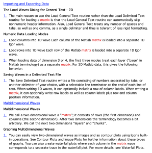
I attach an image of a more hierarchical arrangement that fixes these issues. I confess that it's not really all that good—the main problem is that I can't come up with a good place to put the link to the lowest-level text. I put it in the 1., 2., 3., numbering but I expect that there is a better way. The key point, though, is that a nested scheme like this makes it much clearer how the different results are logically grouped together.


