Need help adding color to my boxplots


theo.nahemt
Hi folks,
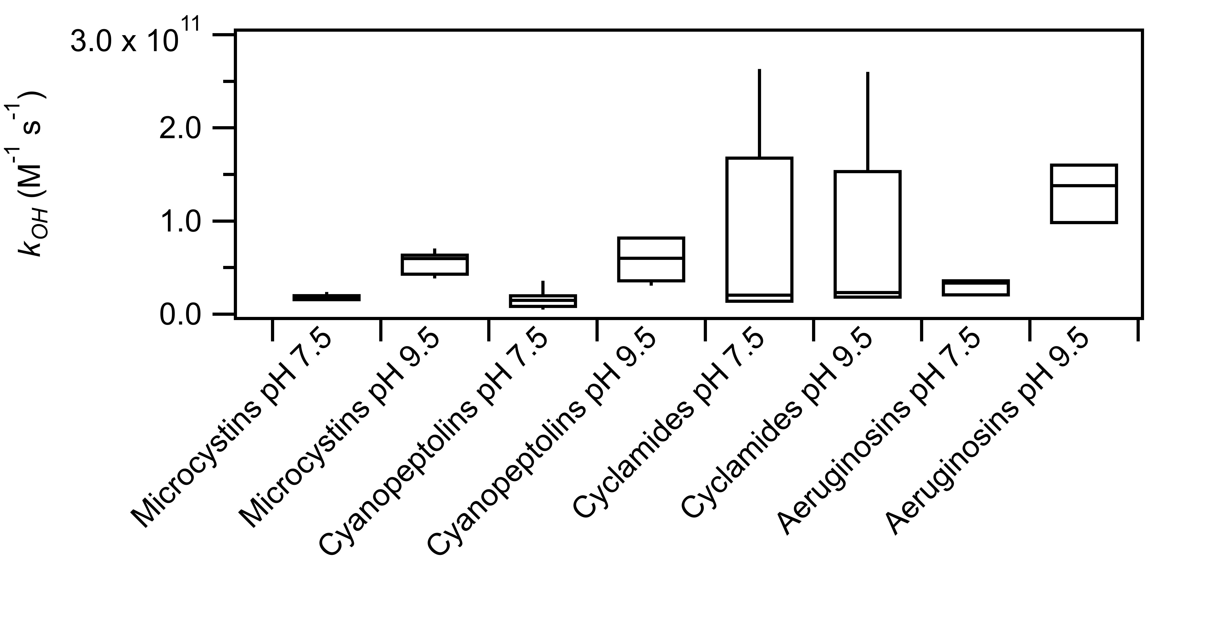
I generated a box plot using the "Percentiles" tool in the "Statistics" option. I am having difficulties figuring out how to color my boxes.
For instance, in my attached box plot, I want the boxes for "Microcystins pH 7.5", "Cyanopeptolins pH 7.5", "Cyclamides pH 7.5", and "Aeruginosins pH 7.5" to be light red, and the boxes for "Microcystins pH 9.5", "Cyanopeptolins pH 9.5", "Cyclamides pH 9.5", and "Aeruginosins pH 9.5" to be light blue. How do I go about doing so? I tried "modify trace appearance" but it does not seem to work.
Any help provided would be deeply appreciated.
The boxes seem to be plotted as error bars, so in the Modify Trace Appearance panel you need to check out the options these.
To change all boxes you could compose the following command (or execute it from the command line):
ErrorBars/L=0 k_OH_Percentile_50#1 BOX=(65535,21845,0,32768),const=0.3,wave=(k_OH_Percentile_75EB,k_OH_Percentile_25EB)To apply two different colors, you probably need to display the data as two independent traces.
EDIT:
Which Igor version are you using?
Unless it's ancient you should be using the built-in box plot option, under Windows -> New -> Box Plot. Then right-click on the new graph and select "Modify Box Plot Appearance" to adjust to your liking.
March 18, 2025 at 06:14 am - Permalink
As the author of both the box plot procedure and the built-in box plots, I fully endorse what ChrLie says. And if you use the built-in box plots, be sure to use Igor 9 as a number of features were added to the built-in box plots, including the ability to apply appearance modifications, like box fill color, to the individual boxes.
DisplayHelpTopic "Box Plots and Violin Plots"
March 18, 2025 at 09:18 am - Permalink
The built-in box option works! Not sure how I managed to miss that function.
Thanks!
March 18, 2025 at 10:09 am - Permalink
I just checked the procedure file- if you select Window->New->Packages->Box Plot, you get a window warning you that the procedure is obsolete. But if you use the percentile control panel, the option to plot the result as a box plot uses the obsolete procedure to draw the box plot. I have entered a ticket to upgrade that control panel to use built-in box plots.
March 18, 2025 at 05:21 pm - Permalink
I have another question. Using the Window->New->Packages->Box Plot, I managed to reproduce the boxplot (with a linear y-axis) that I previously made for one of my datasets. However, when I changed the y-axis of my new boxplot to a log-scale (which is what I ultimately want), the resulting plot is, for lack of a better phrase, all screwed up. See attached. I can't figure out what I am doing wrong. I compared all the graph parameters used to create my new boxplot (made using Window->New->Packages->Box Plot) vs. my old boxplot (made using the percentile control panel) and they look the same. I tried it on another set of data, and I get the same issue, that is thing look fine when the y-axis is linear, but when I change the y-axis to log-scale, the boxplot gets screwed up.
Any help provided would be deeply appreciated.
March 21, 2025 at 02:40 am - Permalink
Log Y axis is the only way in which the obsolete procedure is better than the built-in box plot. The good news is that I have added support for log Y axis for box plots and violin plots. The bad news is that you have to wait for Igor 10, due for beta testing "soon". In the meantime, you can get most of what you need with log-transformed data. That, of course, implies a box plot based on a log normal distribution.
March 21, 2025 at 09:08 am - Permalink
Your suggestion to get around this issue works! Thanks again!
March 21, 2025 at 08:57 pm - Permalink