Category plots, Numeric Values vs Numeric Bins
Short version:
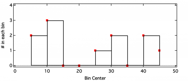
In a category plot of numeric values vs numeric values, how do I center the bars over their x-values?
The top of the bar starts at the value on the bottom axis and is drawn to the next value, BUT the final point's horizontal top is not drawn!
What am I missing?
A plot is attached, and here's some code to plot 3 elucidating examples:
//Graph1: Numeric vs Numeric; Markers
Make /O Vals = {2,3,0,0,1,2,0,2,1}, Bins = {5,10,15,20,25,30,35,40,45};
Display Vals vs Bins; Modifygraph mode=3, msize=4, marker=16, rgb=(65535,0,0);
Label bottom "Bin Center"; Label left "# in each bin";  SetAxis bottom 0, 50; SetAxis left 0, 4
//Graph2: Numeric vs Numeric; Markers and Bars
Display Vals vs Bins; Modifygraph mode=3, msize=4, marker=16, rgb=(65535,0,0);
Label bottom "Bin Center"; Label left "# in each bin";  SetAxis bottom 0, 50; SetAxis left 0, 4
AppendToGraph Vals vs Bins; ModifyGraph mode[1]=5, rgb[1]=(0,0,0);
//Graph3: Text Category
Make /T/N=(dimsize(Bins,0)) Bins_text = Num2Str(Bins[p])
Display Vals vs Bins_text;
Label bottom "Bin Center"; Label left "# in each bin"; SetAxis bottom -1, 10; SetAxis left 0, 4
Execute "TileWindows "+WinName(2,1)+" "+WinName(1,1)+" "+WinName(0,1)
The Longer Version:
I have sets of 3D waves with dimensions (16,8,100). I want to find the histogram of each "beam" in a given wave, store it for later, and then plot it. For example, I want to have the histogram of all points at (0,0,r). Then repeat for all beams (p,q).
Now,
histogramHowever,
histogramSo
Display OutputWave[0][0][][0] vs OutputWave[0][0][][1]; ModifyGraph mode=5The coding works okay I think, but I got snagged on the graphing as bars! I can do it as sticks and markers, but kinda like the bars better.
So that's why I'm wondering how to get the "last point" as a bar, or alternatively center the bars on the actual x-values.
I attach the code I wrote to do this, feel free to comment/improve/correct.
Thanks in advance!


Maybe the axis range needs to be fixed to a slightly larger value then actual data range as well.
HJ
June 20, 2016 at 01:04 am - Permalink
Looks more like a feature than like a bug to me...
HJ
June 20, 2016 at 01:16 am - Permalink
Thanks HJDrescher,
It seems bar plots behave differently when you plot a single wave vs its scaling, and when you plot one wave vs a separate x-wave.
For plotting a single wave vs its own scaling, yes I think your suggestion of an offset would work famously.
However, for a wave vs a separate x-wave IGOR still doesn't draw the last bar, even after changing offset & axis settings.
Attached is a multiplot window created with the commands below.
Top plot is wave test vs its internal scaling
Middle plot is wave test_y vs wave test_x
Bottom plot is wave test_y_addpt vs test_x_addpt where I've artificially added a point with value NaN, 32 to y and x, respectively.
The last method (thanks for the suggestion!) could work but for my case it seems like maybe more trouble than it's worth. I have 128 histograms stored in a single multi-dimensional wave, would like to plot them all on a graph, and then use to show the ones I'm interested in. Figuring out the correct scaling for each histogram's additional point and appending it to the multidimensional wave could (somewhat easily...) be done but I'm hesitant to add "fake" data to an actual data set from our lab... Oh well.
Yes clearly a "feature"!
Cheers,
Dave
June 20, 2016 at 09:13 am - Permalink
The 'feature' part: it provides non-equal widths of the bars - which might be handy at some point.
If I remember correctly, the additional data point is also necessary for images of the 'y vs x' kind (also defining the 'height of the related pixel'). This is quite useful if you want to plot color coded spectra in a temperature series with different steps according the interesting reaction temperatures (similar to http://www.ncbi.nlm.nih.gov/pmc/articles/PMC3920861/figure/fig2/).
I understand your hesitation with the extra data value. However, NaN is somewhat special and might be used here. Good documentation is essential in such a case.
Another approach would leave the original data untouched and use a fixed (N+1) point display wave with the NaN as last data point assignment of only the actual N data points. Something like & scaling (Note: Zero based indexing). It might also run faster than hiding/showing a lot of traces (I use this method for 5000 waves with 2000 data points each; the hiding approach froze Igor for a couple of seconds - this method runs smoothly.)
Cheers,
HJ
June 20, 2016 at 02:33 pm - Permalink
Thanks for clarifying the feature part of it, non-equal bar widths is a useful trick to have in my back pocket for later.
I've settled on going with sticks and markers for now, for ease of implementation.
Also your thoughts about changing a displaywave's definition instead of using hidetrace make sense and sound useful when dealing with lots of waves & points. In my case it's typically <50 waves with <30 points each, and so hidetrace also provides an easy way to keep all the data together when making graph copies as new experiments.
As a side note, I'm not sure why you say Igor does not behave differently. As you say it calculates the N+1 position from scaled data, presumably using something like . It does not do this with two N-point waves, understandably, since there's no guarantee the N+1 point will be at the same interval. This is different behavior, no? In any case, this is probably worth it for the capability of unequal bar widths, as you mention.
Thanks again for your help!
Dave
June 21, 2016 at 07:38 am - Permalink